Showing posts with label Self Evaluation. Show all posts

Thursday, 23 April 2015

Self Evaluation: "Slipping on a Puddle" Animation

I'm combining the second playblast with the self evaluation for the "Slipping on a Puddle" animation. This is because this animation is quite a bit shorter than the others and I don't want to risk repeating myself.


So this was my last planned animation. Unfortunately it had to be shorter due to time constraints but I'm hoping my longer animations make up for the content total for the hand-ins.

That being said, I enjoyed making this animation and am happy with the result.

I finished up the footwork and I'm pretty happy with how it turned out. The last time I attempted complex footwork was the sword swinging animation from last semester. This one also required a lot of guess work as it is hard to act out. I was scrubbing the timeline a lot and looking for where the force was pushing the character and what movements I'd need to make to counter-balance but also allow the character to lose that balance and fall backwards.

Whereas my other evaluations cover aims such as: pacing, story/character and animation quality, I feel the characterisation was harder to convey in a shorter scene. However I did set-up a walk cycle trying to give a little taste to what this character might be like.

I wanted a character that obviously wasn't looking where they were going. I have done the drunk walk before so decided to go for an over-the-top jolly fellow striding along without a care in the world. He then encounters a slippery surface and all sorts of shenanigans ensue as he falls on his back.

Had I had more time I could've went crazy with this. I could've had greater arm flairs and more comedic actions. I could've prolonged the fall even longer or added a more exaggerated Looney Tunes-esque pause in mid-air before falling.

The animation quality isn't my best but I was still happy with how it turned out. Unfortunately time was not on my side due to other modules and lots of hand-ins so I had to cut my time short to work on this one.

This will be my last animation for semester. Thanks for reading!

Thursday, 16 April 2015

Self Evaluation: "Waking Up" Animation

This self evaluation is on my "waking up" animation which is the longest animated scenario I've created this semester and one of the most complex, despite its slower pace and less action packed narrative.


This self evaluation, like the others, will look at the following aims: pacing, story/character and animation quality.

The pacing in this animation was intentionally slow, but the actions contained in the scenario are played out at with appropriate timing. I've avoided a lot of the 'floatiness' in my older animations by again playing a lot with the graph editor.
When the character attempts to hit the snooze button his alarm clock, there are both good and bad points to make on the timing. I think the upper arm action is good but the wrist movement can feel a little "out of time" with the rest of the arm movement. The character is supposed to be tired so it makes less sense that the wrist would be moving independently "stronger" than it should've been.

The character in this scenario comes across quite strong, as does the narrative. It's something that almost everyone can relate with as we've all been in that situation (some of us daily).

I mentioned in an earlier post about the acting principle "A Scene is a Negotiation". I think considering this and thinking about this principle has really improved the storytelling in my animation. I also think having the longer length of time has allowed me to explore more actions and therefore improved the narrative and characterisation.

A lot of the actions are much more subtle in this scene: the yawn, the attempt to wake up, the drowsy head movements. The subtly has allowed for the scene to feel more natural and realistic,

The animation quality overall is good, very good in parts, average in others. Just like my "Sitting Up" animation, I've struggled to get the "pushing" force perfect. I have managed to animate a better attempt but I couldn't find the best pose to get the best "push" out of it. His arms were a little short compared to his body here so he only has a small push, even with the large bend in his body. The IK also snaps the elbow a little bit which is unintended but a lot less noticeable than in my animations from last semester.

Overall I'm very happy with this animation I'm most proud to show this one to others. I worry that its length will be looked badly upon in grading and that my next animation may not live up to this one. I do have only a couple of weeks left and I'm already struggling with time as it is, so I'll be starting on my next (and final) animation very soon.

Monday, 23 March 2015

Self Evaluation: "Robot and the Button" Animation

This self evaluation reflects on my latest animation "Robot and the Button" which is a small animated scenario about a robot finding a button.


In this blog post I'll cover the following aims: pacing, story/character and animation quality. I also look at how the research I've done has informed my practice.

The pacing was originally too slow unlike my last animation. I sped it up so that the character's tempo matched its character. I feel like I've given this animation enough time for each action, no action is particularly rushed and its easy to interpret the story. That being said, the reaction 'double-take' to seeing the button could've been extended and there could've been extra reactions I could've put there if I wished to enhance the character or create more mystery. I chose not to purely because I felt the scene was complex enough and that I'd like to move on and animate something different.

The character I wanted to convey was a child-like, innocent robot with a bouncy and curious personality. From working with this character in 'Professional Project' I was reminded of Wall-E who has a similar box-like structure with big eyes and a curious nature. Unlike Wall-E, this character's eyes are static. While this was intended and I am happy with the amount of character I got from this model, I would like to try animating a more complex character which does have pose-able eyes.

I feel the actions I made the character take were appropriate for his character. He is quite observing of his surroundings and wants to investigate things. I've been reading Ed Hooks' Acting for Animators and one of his seven essential acting principles is about "Acting is Doing, Acting is also Reacting". He describes how not all characters would react the same to an action but all characters would react. Seeing the character's reactions on screen tells us about the character and we read the story and environment through the character.

Animation quality was again okay, still an improvement over my previous animations but not quite there yet. Not much I can do but keep animating and get a little better each time. This animation required me to think over all the little details: the footing, the head movements, the pauses and reactions. The walk cycles aren't as 'floaty' as some of my older animations and its evident my use of the graph editor has helped to tackle some issues. I think I could've tweaked curves further, particularly in the way the character moves across the screen. The walk cycle looks all right but the translation along the screen is quite uniform, but I guess he is a robot after all.

Overall I'm quite happy with this animation, I enjoyed making it and felt more like a little scenario than some of my other work. It did take longer to make but at 12 seconds this does exceed the time frame I was aiming for.

Wednesday, 25 February 2015

Self Evaluation: "Standing Up" Animation

This is a self evaluation post on my "Standing up from a chair" animation which I have set as "completed" however I may still have a chance to work on it later.


This evaluation will cover the following aims: pacing, story/character and animation quality.

From the first and second playblasts, I did slow down the pacing of the animation but I feel I could've went further on this. For example when he sees his friend he jumps straight into a wave. It would've been nice to have seen some additional action here such as squinting his eyes or taking a moment to register if that was his friend or not. I definitely attempted to go for a slower more realistic/natural scene rather than my usual slapstick scenarios. I do think there's some subtlety in there but could have paused longer on actions or exaggerated them to come through more strongly.

The narrative was decent I think, not great but not bad either. It is definitely an improvement over a similar animation I made last year. Whereas that animation was a simple wave, there was no story to it and therefore no character could really be shown. With this animation I wanted to put that character in a place and time and therefore I put more consideration into what he was thinking and what he was reacting to.
I could've expanded on the moment at the start, perhaps increased agitation or fidgeting if he was nervous or perhaps taking a more active interest around the place he was sitting. If he was more relaxed then perhaps I could've gave him a more laid-back pose.
I tried to avoid any moment where the character was still, he's always moving ever so slightly in every frame. I did not finish off the animation so well, I tried to anticipate any future actions he may take but his rest posture and future actions could've been set-up better.

This is the first animation where I've used the graph editor in more depth (other than some basic tests) and while there are no quick accelerations or demonstrations of impact forces, I did use the graph editor to my advantage in places such as the instant he sits up which I made have a steep curve to get that slow start up into a quick sit-up.
I feel this animation isn't as "floaty" as my previous animations but it isn't perfect either. The sitting up part suffers from a few issues which I tried my best to solve. One issue is that I don't feel like he is properly "pushing" against his knees to assist him in sitting up. I think this issue is related to the pose he is in. Either I need to have his body further forward or have his hands located elsewhere.
I tried out the action in real life a good few times and while it helped me to solve a few issues it still wasn't perfect. The rig itself does have quite long arms and the shoulder movements can be limiting sometimes.
The arms themselves feel like they're just attached to the knees rather than pushing against it. This is because I used IK controllers which dictate where the elbow joint bends based on the position of the hands and the shoulders. However if I were to use FK controllers then I'd have more control over the elbows (and therefore control over the "push") but would instead have the hands constantly clip through the legs as his body moved. I picked the lesser of two evils and went for the IKs so I could have the hands firmly on the legs. This is something I imagine a lot of animators have a problem with and I will attempt to research on how to get around this.

Overall I'm pretty happy with how it turned out. It's not as entertaining to watch as some of my previous animations but there's definitely an attempt to give more subtlety to the character which I was proud of. With creating one animation after the other, it will allow me to take my own advice and apply it to my next animation.

Wednesday, 4 February 2015

Evaluating Last Semester's Work

As discussed, as I wanted to have a more evaluative approach to my work, I will be taking a look at my previous work.

To evaluate an animation I decided to make a video report where I highlight parts of my animations where there is room for improvement.


To summarise the video I make these key points:
  • 'Impacts' need to be stronger - i.e. footsteps
  • Work on timing - it affects the forces, weight, narrative and believability
  • Reduce 'floatiness' of animations - combat with timing, graph editor, and poses

Wednesday, 3 December 2014

Self Evaluation: Animation Power Centres

Note: The animation work done in this post was done for Creative Research. However the evaluation has been solely written for this blog.

In Creative Research I have been exploring power centres and how they are used in animation to help convey a mood or sense of personality or emotion in a character.


I decided to evaluate this task on these aims:
  • Timing
  • Posture
  • Personality/Character
Timing

Power centres dictate where a character's energy comes from. A more characterised person will be more influenced by their power centre. Power centres also affect the rhythm of the character. A character with a low power centre will naturally have a slower tempo.

In each of the three animations I made sure to aim to capture the right rhythm for each power centre. I think this was done well, however in the second video (power centre in the waist) I think the timing was off and could have been better worked in with the movements of the waist and hips.

Posture

The aim was to have the power centre of each character affect their posture as well as the way their posture moves as they walk. I think this was done most effectively in the low power centre animation as the character's back seems to bend around the point. As he walks he also bounces around the power centre. This animation I think was most effective in conveying a sense of mood.

With the middle power centre there was not enough rotation in the waist and this would've better helped give him a posture more fitting to his character. In the high power centre animation I think I got the posture correct although I'd have liked to have tried more iterations to try out different ideas.

Personality/Character

My aim of the task was to see how power centres affect a character's personality. I think it was most effective where I let the power centre characterise the character more such as in the low power centre animation (first video) and was least effective where I didn't allow the character to be as influenced as much by it such as in the middle power centre (second video). I think the high power centre (third video) was a happy medium and was satisfactory for the aims but more iterations of that one power centre could have yield different personalities.


Overall I think this task was attempted well but I could have gone further with a lot of things. More iterations would be the best idea moving on and there's nothing stopping me from coming back to this task. I think it will help my animations this semester, particularly with the desk flip animation where the character is very tense where he types.

Friday, 14 November 2014

Self Evaluation: Character Design

So I was recently asked by the school my mother works for to design a small character for their campaign against bullying. There were some specifics to its design such as:

  • should include the school's logo
  • should include the school's colours
  • have a similar aesthetic and design to 'Mega Man'
One thing I will note right now is that I am not a character designer, nor am I an illustrator, or even a good 2D artist. But I do love Mega Man and since the school would be pretty much happy with whatever design I gave them there was no pressure for it to be of a high professional standard. However that doesn't mean I didn't try to make it of a high professional standard, its just that this was something out of my expertise so I told them not to get their hopes up (wow, so optimistic).

Anyway, I wanted to turn this into a little self evaluation for this blog. As its more of a mini project itself I wanted to focus on the basic illustration elements of the design.

At first I did some research into Mega Man, the proportions of his body and how he is built as a character. I did a few sketches of Mega Man just so I could understand why his design is good.


From there I just doodled to see what I could come up with.

After some feedback from the school they were happy for me to finalise a design.


So as I said, I'm no character designer, but I was pretty happy with how it turned out. Sure it may be a little cliché and unoriginal but whatever, the school were happy with it.

I thought I'd turn it into a little self evaluation though. Surely any work is good work towards self improvement so I'll evaluate this mini project with these aims:
  • Design
  • Pose
  • Line Work
  • Colour
Design

"Anti-bullying" and Mega Man were the only two things I were given to go on. Being a primary school they are also not bothered what I did with the design. So I made sure to keep it simple, it would've been easy to get carried away with all sorts of robotic elements but keeping a Astroboy/Mega Man superhero look (the cape helps with that) means its easy to identify as a hero or good guy.

I was happy with the design overall and for the time scale I was given (about 2 weeks in spare time amongst other work) I thought it was fine.

Pose

I include this evaluation in here as although part of the design, I think it can be applied to other work if considered separately. I tried a number of different poses and angles for the character. From my visual research of Mega Man (mostly just memory) there's a lot of action shots. This helps give the idea of superhero, action fighter type of character. I think this was where the school wanted the Mega Man influence to be in relation to anti-bullying.

I originally had a stance with a simple thumbs up but from feedback from others I decided to go for a mid-running pose. I'm not so comfortable with making up poses on paper, I can never seem to get the proportions right or the action looking strong enough. This is something I have been actively working on (mostly in Creative Research) in order to improve my animations. As you can see from the sketches there are some dodgy poses. When I brought this over to digital format I was able to correct things like the legs and get them looking more natural. I think this was done satisfactory but there's always room for improvement.

Line Work

My typical 2D digital work often consists of Flash style drawings, mostly with thick lines and not much variation in them. I tried to go for a thinner line than usual which helped to make it a more crisp design but there's still a long way to go.

Something I've recently discovered is using a colour palette just for line work, where it takes a shade of colour from the object, darkens it and uses it for the line, rather than just black all the time. Although this is more of an illustrator based skill to practice, there's no harm from exploring this further at some point.

Colour

I include this skill evaluation mostly to do with the shading and shadows included in the final design. It's actually the first time I've used shadows in a 2D cartoon drawing. I thought I managed to do this reasonably well for a first attempt. They just help to give the character depth and form as opposed to a flat image.

If I were to improve upon this, I would tie the colours in to the line work to just improve the quality of the drawing overall.

Thursday, 2 October 2014

Self Evaluation Strategy

From my understanding the Self Evaulation Strategy is the way I will reflect upon any research or development tasks I do. It will accompany work as a way of evaluating what I have done, how well it was done and how it can be done better next time.

So this blog post can be more summed up as a self evaluation strategy - strategy. I have already conducted three in-class self evaluation studies and hope to tackle a few of my own in time. However, I will also apply my self evaluation to all work I post, either through progress reports reflecting on my work or through development of ideas that I can reflect upon.

I will ensure that any self evaluations I do reflect my own field of work, such as how applying techniques field can benefit my animation skills.

Hopefully I can get a hang of this self evaluation strategy and tackle it in a way that benefits me to help improve.

Friday, 26 September 2014

Self Evaluation: Live Drawing


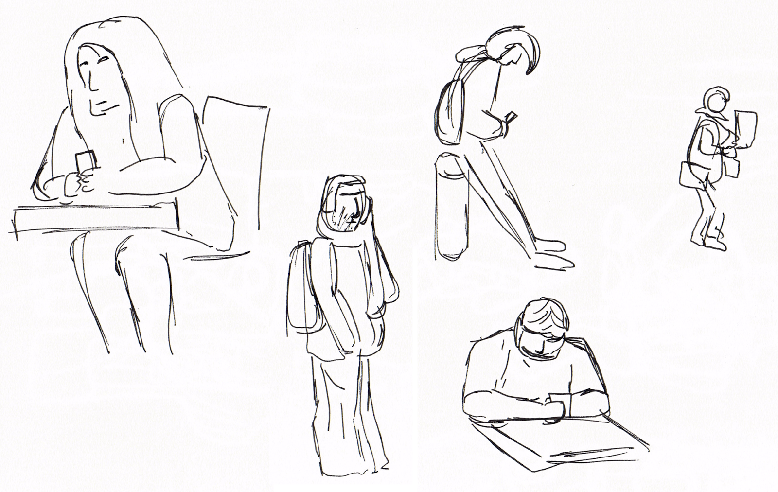
Today's class task was "Live Drawing", where you sit in a public place and quickly sketch people as they walk by or hang around in the area. The focus is not in accuracy but at capturing the essence of the person in the moment.

I headed first to the lobby in Abertay's Kydd Building knowing that people will be passing through. My favourite drawing here is the lady resting her elbows on the table, although she was just resting her head on her arms it appears she is enjoying a good sandwich here,


There was the odd lull in activity and not much variation in the angles people were facing (mostly just to the receptionist) so I made my way across the road to Bar One (where a large number of the class were already located). There were many people walking outside doing a variation of things, each with their own little story. I became more comfortable with drawing people here so there are some more interesting sketches going on here.
My favourite sketch here is the lady carrying a lot of coats and also the lady carrying all the boxes. Both of pose the question "why do you need so many of those things you're carrying?"


For the sake of variety and wanting to go somewhere different I headed to the first floor of the library and sat in front of the window to draw. People were closer up and generally paused for a little longer giving me a quick chance to sketch them out before they moved on.
I came up with a lot more interesting sketches here so I have a few favourites including the suited man with a simple rectangular face (and nose) as well as the ridiculously dressed student with hilarious hat. The old couple that spent some time at the town map where so characterised they were adorable to draw.

The skill evaluation aims were:
  • Working quickly and fluidly
  • Capturing sense of movement
  • Capturing sense of personality or character

The first aim I think I achieved well. The entire exercise was something I got better with as the class went on with the more interesting and better sketches coming later on as I was more comfortable with the task. Although I could have filled out a few more sketches the problem with getting this done was mainly in relation to the second aim.

Capturing a sense of movement was a slightly challenge, mainly because of how fast people walk and how trying to take a snapshot and draw them in that pose is tough. I would've like to have tried drawing one person walking over a distance in multiple poses even if I didn't manage to get all their limbs in each time.

Capturing the sense of personality and character in a sketch came from how the person was drawn, as in which bits were focused on or even exaggerated. This was something I think got better over time with my more interesting drawings coming out at the end.

Thursday, 18 September 2014

Self Evaluation: Tonal Drawing

During this week's practical we were tasked with a tonal drawing study. Two objects were given to us which contrasting in their brightness and material. This was my drawing which took around 1h30m to complete:

The skill evaluation aims were Observation, Tonal Range, Shading and Challenge.

Observation

I think the proportions of the objects were good and that they do look like the objects they are meant to represent.

Tonal Range

I used a selections of pencils I had including HB, 2B, 4B and 6B pencils. I did create a pencil shade scale and was satisfied on the whole although I'd like to have achieved darker tones but didn't have the correct pencil to allow me to do so. In the drawing I did manage to use the range of tones in the image, from the white box to the darkest point in the shoe.

Shading

The darkest point in the drawing was definitely beneath the laces of the shoes with the brightest part being the direct light hitting the box, I think the lighting on the objects was conveyed satisfactory although not perfect as tonal drawing is not my strongest skill.

I think the shading is let down in the background where I didn't spend as much time on. The paper quality also did not allow for the smoothest shading. If I were to do any future tonal drawings I'd like to invest in some better sketchbook paper.

Challenge

Some challenging parts of the drawing included the surface of the cube which was pretty smooth and very bright white. I did add in any scratches or dirt on the white block just to give it some more definition.

The shoe was also difficult as the material didn't allow for highlights and appears to be consistently black. This meant shadows where the only thing that allowed the object to show its shape.

Saturday, 13 September 2014

Self Evaluation: Perspective Drawing

During this week's Computer Arts Practice practical slot, I was tasked with a perspective study. With about 1h30m to complete it in, this is my drawing:


The skill evaluation aims were: drawing within timescale, observation, line work, and discipline to which I feel I completed all within a satisfactory level. In this post I will discuss both my strengths and weaknesses relating to these aims.

Drawing Within Timescale

With roughly 1h30m, I feel the timescale was generous enough to draw the entire view with the most important lines. A class in orthographic and technical drawing in high school made me comfortable with this exercise in timekeeping, making sure I put in the main lines in first, then worked down towards the details. I then gave myself ample time to correct and clean up lines.

Observation

I spent about 5 minutes just choosing a place I wanted to draw, something that would be interesting and that included enough elements to make a strong drawing. This corridor had a number of wall parts sticking out as well as doors, windows and pipes along the roof.

I picked a challenging spot sitting so close to the wall which gave for an interesting view of the corridor. Luckily there was a seat and table conveniently located in the corridor so that was fortunate.

Line Work

Lines are the main ingredient to a perspective drawing. I used a variation of pencils: a 2B, a 0.3mm and a 0.5mm technical drawing pencils. I also used a ruler to help with time efficiency and to make the lines cleaner and easier to work with. I tend to prefer a single straight line rather than drawing the line several times on top of each other to get a result.

Discipline

Overall I'm pretty happy with my finished drawing. If I were to move on from here I would like to try different perspectives or angles to draw from. Moving on from the single corridor setting I could try a location with pillars or more complicated geometry to add an extra challenge.

The drawing's not perfect though, I could have stepped back from the drawing more to make sure the lines and proportions were better. There is slight distortion in the corridor particularly in the roof at the top right.