Hello again, some more updates on my animations. Probably my last progress report before hand-ins.
The drunk guy walking into a pole animation is still pretty much done. I did some tweaks as he falls down to the ground at the end. From the timing it appears almost like ragdoll physics which is unexpected but I like it. Its definitely not realistic but for an animation its totally acceptable.
The sword swing animation has been really tough. I had to re-do the arm in FK because IK was just not working out. I've also discovered just having a character do anything that has them rotate their body is painful to do with 3D animation (I guess like any animated format?). Trying to keep the sword swinging 360 in a consistent pace is hard, I chose to use IK in the arms for that sole reason to keep the sword moving in nice timing but the arm snapping was much more distracting.
As the sword and/or body does sort of slow down from time I am going to work with this putting in some rotation in the body in the opposite direction (i.e. up and down) so that it appears as if he is fighting with the swords momentum. This may help to make the motion of the sword appear more natural.
I am pretty happy with the footwork though, this was also hard to predict as you can only do so much with animatics, you kind of have to work out where his feet go as his body spins and hopefully keep the balance correct. I think I did this quite well considering how I wasn't entirely satisfied with how the rest of the animation turned out.
The spell casting animation is one I am pretty happy with. Although not perfect the timing for this animation is a bit better, maybe too slow towards the end but I'll get to that in a minute. I like the hand actions and how the interact with the orb but I'm not too sure if they are "epic" enough for the brief (at least at the start) but there is a margin of change I seem to be getting away with for the rest of the animations so I should be fine.
As for the hands at the end, another Maya technical weirdness I had to contend with. The initial keyframes for the hands and arms wasn't getting the motion I wanted. Maya was doing that weird thing where the arms would flop around through the body before getting to their designated positions. I've fixed these type of problems before with the graph editor but this one was going to require more keyframes just to set the arms on the right path. I got them to do what I wanted in the end but I wanted to make them quicker. I will definitely try and correct this before hand-ins.
The stream jumping animation was interesting, I still struggle to animate any convincing run animation. It appears as if the character is being careful of her footing rather than running, which in a way works for this setting as it is hazardous after all. Again timing was an issue here, the actions themselves seemed decent enough, they were just sometimes a little jittery from the timing.
The story in the animation changed a little bit from the animatic, instead of losing balance on the rock the way the character's momentum was working I though it'd be better to just continue with the jump and using her arms and legs to balance hereself as she was doing that. I feel that was better than trying to stop to balance when it didn't really need it.
Finally, the desk flip animation has been working out fine. Although not the main purpose of the animation, the typing part worked surprisingly well. I was happy with the main action of the table flipping and I think this is one of my better animations for telling a little narrative. Having thought of this one last I think it was the result of learning from experience.
On a side note, rendering stuff in Maya 2013 is weird. I picked the exact same render settings as in Maya 2011 but it decides to do that weird thing where the video flickers and its cut in half and stretched diagonally? I don't even know how but... Maya. Anyway, I rendered the video uncompressed which works then used MPEG Streamclip to compress the videos right back down to an acceptable level.
Long post, well hand-ins are this week so I better get back to work.
Tuesday, 9 December 2014
Wednesday, 3 December 2014
Self Evaluation: Animation Power Centres
Note: The animation work done in this post was done for Creative Research. However the evaluation has been solely written for this blog.
In Creative Research I have been exploring power centres and how they are used in animation to help convey a mood or sense of personality or emotion in a character.
Overall I think this task was attempted well but I could have gone further with a lot of things. More iterations would be the best idea moving on and there's nothing stopping me from coming back to this task. I think it will help my animations this semester, particularly with the desk flip animation where the character is very tense where he types.
In Creative Research I have been exploring power centres and how they are used in animation to help convey a mood or sense of personality or emotion in a character.
I decided to evaluate this task on these aims:
- Timing
- Posture
- Personality/Character
Timing
Power centres dictate where a character's energy comes from. A more characterised person will be more influenced by their power centre. Power centres also affect the rhythm of the character. A character with a low power centre will naturally have a slower tempo.
In each of the three animations I made sure to aim to capture the right rhythm for each power centre. I think this was done well, however in the second video (power centre in the waist) I think the timing was off and could have been better worked in with the movements of the waist and hips.
Posture
The aim was to have the power centre of each character affect their posture as well as the way their posture moves as they walk. I think this was done most effectively in the low power centre animation as the character's back seems to bend around the point. As he walks he also bounces around the power centre. This animation I think was most effective in conveying a sense of mood.
With the middle power centre there was not enough rotation in the waist and this would've better helped give him a posture more fitting to his character. In the high power centre animation I think I got the posture correct although I'd have liked to have tried more iterations to try out different ideas.
Personality/Character
My aim of the task was to see how power centres affect a character's personality. I think it was most effective where I let the power centre characterise the character more such as in the low power centre animation (first video) and was least effective where I didn't allow the character to be as influenced as much by it such as in the middle power centre (second video). I think the high power centre (third video) was a happy medium and was satisfactory for the aims but more iterations of that one power centre could have yield different personalities.
Monday, 1 December 2014
Progress Report - Week 13
Hello, just an update on where things are at on my animations.
The "walking into a pole" animation is basically done, just a few tweaks here and there when I have time.
The sword swinging animation is getting there, I struggled with the technical side of things getting the sword to attach to the hand but I've got that working now. (turns out you can keyframe the parent constraint at the frame where its meant to bind)
I am having problems with the IK (inverse kinematics) in the arm, I thought it would be easier to do this instead of FK (forward kinematics) but as the character turns his arm retracts and snaps a lot which is the opposite of what I wanted it to do, the arm should be straight at all times as the sword pulls him along. Currently the way to fix this is to set a lot more keyframes than I'd hoped which may lead to future problems. Alternatively I switch back to FK and re-do the arm, which is a shame because I just figured out how to switch to IK to begin with.
The stream crossing animation like the spell casting is being done in Maya 2013 so I can use the very advanced Mery rig which is a joy to work with. I've currently got to the point where she is ready to make the first jump. She initially flexes her arms before making a short run up to the stream. From there I'll have her make contact with the rock and attempt to bring down the other foot so to carry her momentum.
The spell casting animation is looking all right, I've got her hands and arms moving in a way I'm happy with. I'll get to the fingers later. I've added in a polygon sphere as a sort of placeholder for any particle effect that would've been used. Its helping me to get an understanding of what she's actually casting and how she will use it. Still need to animate the part where she uses the spell to shoot at something.
Desk flip animation was put on the side until last week or so. I have a good idea for it and like the drunk walk its going to be fun to animate. I've got the scene setup and some initial keyframes done on the body as he types and reacts to the computer failure.
Not much else to say, I'll just carry on making stuff.
Friday, 28 November 2014
Desk Throw Animatic
For the last animation which is an action of your choice I decided to go with a good ol' desk flip. I didn't sketch any of this out and instead had the idea in my head which I generated into a quick animatic.
The main things I want to include is some angry concentrated typing, followed by an indication that something went wrong, then the character losing it and flipping their desk over.
I explored other ideas such as what sets the character off: either a blue screen of death which is universally recognisable or perhaps a crashing sound. The characters sudden change of mood should be easily associated with something going wrong with the computer (everybody's been there).
Thursday, 27 November 2014
Storyboards - Final
These are the final storyboard sheets for my animations. These were taken from the animatics.


Tuesday, 25 November 2014
Progress Report - Week 12
Thought I'd write a progress report since I've just been getting on with animating and don't have much else work to post.
I've not got 4 out of 5 of my animatics done. I will start considering the last animation soon but would like to do a desk flip animation.
I've done the most amount of animation work on my drunk guy walking into a pole animation. I've animated the part of him stumbling up to the pole and smacking his face against it with a bit of dizzy recoil. The walk cycle was mostly taken straight from the animatic with the large strides and staggered timing. I made sure he wasn't going to anticipate walking into the pole as in his mind he would be near it. The impact with the pole is just a head smack and recoil to the point where his head bends right back (its okay, its a cartoon). I'm pretty happy with it so far. Next I will add arm movements into the recoil as if he was about to fight someone before falling back on himself and falling unconscious.
In the sword swinging animation I've got the character bending down (apparently that's not easy to do but I was happy with the result I got) to pick up the sword. Its slightly than he imagines so he doesn't just pick it up in one action, he sort of retracts and pulls it up a second time with more force from his body. I'm switching the arms from FK (forward kinematics) to IK (inverse kinematics) the moment he makes contact with the sword so that I can move the sword around and his arm follows. Meaning I can animate the sword and the character will be dragged along with it. I've used a parent constraint to bind the sword to the hand controller but I need to figure out how to apply it to the point after he makes contact with the sword.
I will be using Maya 2013 for the spell casting animation in order to use the Mery rig (only works with 2013+) as it has more advanced hand controllers allowing for easier animation when it comes to conjuring the spell itself.
I've also built the scene for the stream crossing animation which I will start this week.
Thursday, 20 November 2014
Stream Cross Animatic
Decided to keep this more on the simple side of things compared to my other animations. The character will simply cross the stream by jumping on a rock that's sitting in the stream. They pause to find their balance before jumping across to the other side.
Friday, 14 November 2014
Self Evaluation: Character Design
So I was recently asked by the school my mother works for to design a small character for their campaign against bullying. There were some specifics to its design such as:


- should include the school's logo
- should include the school's colours
- have a similar aesthetic and design to 'Mega Man'
One thing I will note right now is that I am not a character designer, nor am I an illustrator, or even a good 2D artist. But I do love Mega Man and since the school would be pretty much happy with whatever design I gave them there was no pressure for it to be of a high professional standard. However that doesn't mean I didn't try to make it of a high professional standard, its just that this was something out of my expertise so I told them not to get their hopes up (wow, so optimistic).
Anyway, I wanted to turn this into a little self evaluation for this blog. As its more of a mini project itself I wanted to focus on the basic illustration elements of the design.
At first I did some research into Mega Man, the proportions of his body and how he is built as a character. I did a few sketches of Mega Man just so I could understand why his design is good.
From there I just doodled to see what I could come up with.
After some feedback from the school they were happy for me to finalise a design.
So as I said, I'm no character designer, but I was pretty happy with how it turned out. Sure it may be a little cliché and unoriginal but whatever, the school were happy with it.
I thought I'd turn it into a little self evaluation though. Surely any work is good work towards self improvement so I'll evaluate this mini project with these aims:
- Design
- Pose
- Line Work
- Colour
Design
"Anti-bullying" and Mega Man were the only two things I were given to go on. Being a primary school they are also not bothered what I did with the design. So I made sure to keep it simple, it would've been easy to get carried away with all sorts of robotic elements but keeping a Astroboy/Mega Man superhero look (the cape helps with that) means its easy to identify as a hero or good guy.
I was happy with the design overall and for the time scale I was given (about 2 weeks in spare time amongst other work) I thought it was fine.
Pose
I include this evaluation in here as although part of the design, I think it can be applied to other work if considered separately. I tried a number of different poses and angles for the character. From my visual research of Mega Man (mostly just memory) there's a lot of action shots. This helps give the idea of superhero, action fighter type of character. I think this was where the school wanted the Mega Man influence to be in relation to anti-bullying.
I originally had a stance with a simple thumbs up but from feedback from others I decided to go for a mid-running pose. I'm not so comfortable with making up poses on paper, I can never seem to get the proportions right or the action looking strong enough. This is something I have been actively working on (mostly in Creative Research) in order to improve my animations. As you can see from the sketches there are some dodgy poses. When I brought this over to digital format I was able to correct things like the legs and get them looking more natural. I think this was done satisfactory but there's always room for improvement.
Line Work
My typical 2D digital work often consists of Flash style drawings, mostly with thick lines and not much variation in them. I tried to go for a thinner line than usual which helped to make it a more crisp design but there's still a long way to go.
Something I've recently discovered is using a colour palette just for line work, where it takes a shade of colour from the object, darkens it and uses it for the line, rather than just black all the time. Although this is more of an illustrator based skill to practice, there's no harm from exploring this further at some point.
Colour
I include this skill evaluation mostly to do with the shading and shadows included in the final design. It's actually the first time I've used shadows in a 2D cartoon drawing. I thought I managed to do this reasonably well for a first attempt. They just help to give the character depth and form as opposed to a flat image.
If I were to improve upon this, I would tie the colours in to the line work to just improve the quality of the drawing overall.
Industry Awareness - Continued
From the first week of presentations it became clear to me that a lot of classmates were picking companies who they really had a passion for. Although I admire Studio Distract's work their content never really appealed to me as much as I'd liked. Again, although I have a passion for the work of Pixar and Dreamworks, I didn't particularly want to research them again so I kept exploring other smaller companies.
I decided to change my own presentation to focus on another company called StudioAKA, an animation company based in London. They are relatively small and often work with directors who approach them with ideas, they focus on the journey of the project rather than on the end goal.
They have done work in the advertising industry but have also created their own short films. One project of theirs I admired was 'Lost and Found', based on the children's picture book by Oliver Jeffers. The animation style is soft and emotive, which reflects the tone of the book.
For the section on job requirements and skills I kept the same criteria as on my last presentation which can be viewed previously on this blog.
View my presentation on Dropbox: https://www.dropbox.com/s/bjw6ure3wqjrqvg/CAP%20Presentation2.pptx?dl=0
Thursday, 13 November 2014
Pole Walk Animatic
I was eager to start animating and have been doing so already, the frames for this were saved but I just hadn't rendered them out yet. Here is my animatic for the "running into a stationary object" animation, or as I have it: drunk guy walks into pole, fights pole, loses.
Thursday, 6 November 2014
Friday, 24 October 2014
Industry Awareness Presentation
As part of the Computer Arts Practice module we were asked to give a short, informal presentation on research we have done on a company in the industry we want to work for.
I have previously looked at animation companies before for a similar task but I had only considered the larger studios such as Disney Animation Studios, Disney Pixar, Dreamworks and Blue Sky. Although its great to have ambition I thought I would look at smaller companies as they'd be my likely choice following on from university.
I looked at companies such as Blue Zoo, Axis Animation, and others but decided to look further into Studio Distract, a 3D animation studio based in Manchester. They have worked on a lot of producing their own content as well as working with clients such as Disney, Hasbro, BBC and Mattel.
A project they are currently working on is Rollie & Friends. An animated series targeted towards children and located in a theme park. The company have designed everything themselves from the characters and environments to the character rigs and story.
You can take a look at their showreel for more information or see my presentation attached at the bottom of this post.
Studio Distract 2014 Animation Showreel from Studio Distract on Vimeo.
While this studio didn't have any animation jobs currently available, I used the other companies I looked at to gather a basic understanding of what's required from a 3D animator. Some companies hired freelances while others had some permanent jobs. A showreel is always required and having experience in the industry always helps.
The skills required are the same as most jobs in the creative industry such as good communication and teamwork skills and the ability to work within a deadline. Skills more specific to animation include an understanding of the principles of animation, knowledge of anatomy and cinematography.
View my presentation on Dropbox: https://www.dropbox.com/s/skqok726frfyfto/CAP%20Presentation.pptx?dl=0
Wednesday, 22 October 2014
Concepting Story Ideas - Crossing Stream
I was less sure of where to go with the idea for the crossing the stream animation. I originally had the idea of having a character going for a jog while talking to a friend behind him, he'd then turn around just before the stream and attempt to make a safe crossing but would still be carried forward by his momentum and then face plant the other side of the riverbank.
It was a little too similar to the pole walking animation and decided to go for a more cautious approach the stream as an obstacle to be crossed. I've not fully explored this idea, I'll come back to this later.


Sword Swing Animatic
I've finished my first animatic for the sword swinging animation. I'm pretty happy with it as it effectively conveys what I want the animation to look like.
I was told there were perhaps too many frames in it for an animatic and that I was spending maybe too much time on it. I will try and cut down on frames where possible so that I can get to animating sooner.
I was told there were perhaps too many frames in it for an animatic and that I was spending maybe too much time on it. I will try and cut down on frames where possible so that I can get to animating sooner.
Monday, 20 October 2014
Concepting Story Ideas - Walking into Pole
Originally I had the character being unaware of their surroundings and simply running into the pole. After some research and thought I wanted to animate a drunk person and so they would not be walking or running, more like stumbling around.
After knocking into the pole they would be dizzy and think of the pole as a person wanting to fight. I also wanted to have the character fall in the end from drunkenness and injury.


Concepting Story Ideas - Casting Spell
For the spell casting animating I'd like to have the character forge this ball of energy using their hands which they then use and cast outwards as an attack.
The character knows the spell so should move with a sense of confidence and not hesitate to perform the attack.
I will probably use the Mery rig for this animation because of the good setup in the hands.


Concepting Story Ideas - Sword Swing
I want to get my storyboards done quickly in order to move into animating as soon as I can. For structured feedback week my aim is to get most of the animatics completed.
These are some initial sketches on what I plan to animate for the sword swinging animation.


Monday, 13 October 2014
Animation Research - Running into Stationary Object
For my "running into a stationary object" animation I have decided to animate a drunk person walking into a pole. So the things I will want to consider while animating this is:
- How the character's intoxicating affects how they walk.
- Their reaction to walking into the object.
- How they are knocked back by the impact.
Luckily there's no shortage of drunk people on the internet, and there's even a decent number of videos containing drunk people walking into poles in the street.
Animation Research - Sword Swing
As part of my research into my brief I have been looking at similar animations to the actions I will be animating myself as part of the coursework.
For the sword swinging animation I'd like to include the character picking up the sword, finding it to be heavier than expected so he puts more effort into picking it up but gets carried away by the swords own momentum once in the air.
So there will be a moment of him bending down and putting effort to lift something heavy. The second part of the animation will be the character trying to hold his balance as he swings the sword 360 degrees.
Here are a few clips I gathered that have helped me with coming up with how to plan the animation (footwork, balance, posing, etc.)
As the character swings the sword 360 degrees I wanted the sword to be be in control of him, to show how he is not very skilled in using a sword. I looked at Weight Throws from the Highland Games to get an idea of how people balance themselves while swinging something around them. I want to do something similar in my animation.
Thursday, 9 October 2014
Animation Style
As part of this brief I want to consider the animation style that I am wanting to use. By animation style I mean what principles of animation are being used, how much they are being used and to what effect.
The brief emphasises the use of exaggeration. John Lasseter describes exaggeration in animation as "If a character is sad, make him sadder; if he is bright, make him shine; worried, make him fret" in order to make sure the audience understands the action or emotion better.
But exaggeration is not just limited to character actions. Physical features of a character or environment, or elements in the story can balance exaggerated elements with each other.
Exaggerated expressions are often expressed using other principles of animation, such as squash and stretch, and anticipation. In this clip of Genndy Tartakovsky's Popeye animation test, there is a huge emphasis on the squash and stretch of characters to make them navigate their environment with ease and to exaggerate the actions in the fight scene (see 1:57).
The 12 principles describe exaggeration is as "not extreme distortion of a drawing or extremely broad, violent action all the time. It's like a caricature of facial features, expressions, poses, attitudes and actions. Action traced from live action film can be accurate, but stiff and mechanical. In feature animation, a character must move more broadly to look natural. The same is true of facial expressions, but the action should not be as broad as in a short cartoon style. Exaggeration in a walk or an eye movement or even a head turn will give your film more appeal. Use good taste and common sense to keep from becoming too theatrical and excessively animated." (paraphrased by David Atkinson of The Centre for Animation & Interactive Media, from the "Illusion Of Life" by Frank Thomas & Ollie Johnston.)
So although exaggeration can be linked to a more cartoon style, it doesn't have to. As noted in the Illusion of Life, it can be simply used to more effectively communicate the action or story to the audience.
In this clip of Wall-E, he accidentally runs over a paper cup, his reaction is exaggerated both to emphasise his character as well as convey to the audience his feelings of what he has done. Any person in real life that felt the same may have a similar reaction but may not raise their arms in such a manner (see 3:00).
Using exaggeration in my animations will vary depending on the action. For example in the sword swinging animation I may choose to exaggerate how much the sword is pulling on the character to establish how the character is unable to control it. Or in the "running into an object" animation I may decide to have more recoil in his impact than would be expected.
Thursday, 2 October 2014
Self Evaluation Strategy
From my understanding the Self Evaulation Strategy is the way I will reflect upon any research or development tasks I do. It will accompany work as a way of evaluating what I have done, how well it was done and how it can be done better next time.
So this blog post can be more summed up as a self evaluation strategy - strategy. I have already conducted three in-class self evaluation studies and hope to tackle a few of my own in time. However, I will also apply my self evaluation to all work I post, either through progress reports reflecting on my work or through development of ideas that I can reflect upon.
I will ensure that any self evaluations I do reflect my own field of work, such as how applying techniques field can benefit my animation skills.
Hopefully I can get a hang of this self evaluation strategy and tackle it in a way that benefits me to help improve.
Sunday, 28 September 2014
3D Animation Brief - Plan
I've chosen to take on the 3D animation brief for this semester. In the brief I have to plan and develop five short action tests (5-10 seconds) of the following actions:
- Picking up a heavy sword and swinging it 360 degrees.
- Running into a stationary object and getting knocked back/unconscious.
- Casting an epic spell that needs a lot or arm flailing.
- Jumping across a small stream.
- One action of your own invention in a similar theme.
As well as a final animation reel, the deliverables also include a story board sheet and an animatic of the proposed animations.
I plan to go about this brief by first researching into other animations that use exaggeration and other principles of animation effectively. I will analyse these animations and how they use the principles to define their own animation style.
I will get an idea of what I want to do in each animation by exploring different poses and scenarios. I will develop draft story boards from these and iterate them until I am happy with them. From there I will produce an animatic and if I am happy with the timing, pacing and composition I can begin animating. I will probably be at different stages with each animation at any one time which is fine.
For structured feedback week (week 7) I hope to have a good idea of what I will be animating for each of the five actions by having my storyboards and animatics hopefully finished.
Friday, 26 September 2014
Self Evaluation: Live Drawing
I headed first to the lobby in Abertay's Kydd Building knowing that people will be passing through. My favourite drawing here is the lady resting her elbows on the table, although she was just resting her head on her arms it appears she is enjoying a good sandwich here,

There was the odd lull in activity and not much variation in the angles people were facing (mostly just to the receptionist) so I made my way across the road to Bar One (where a large number of the class were already located). There were many people walking outside doing a variation of things, each with their own little story. I became more comfortable with drawing people here so there are some more interesting sketches going on here.
My favourite sketch here is the lady carrying a lot of coats and also the lady carrying all the boxes. Both of pose the question "why do you need so many of those things you're carrying?"

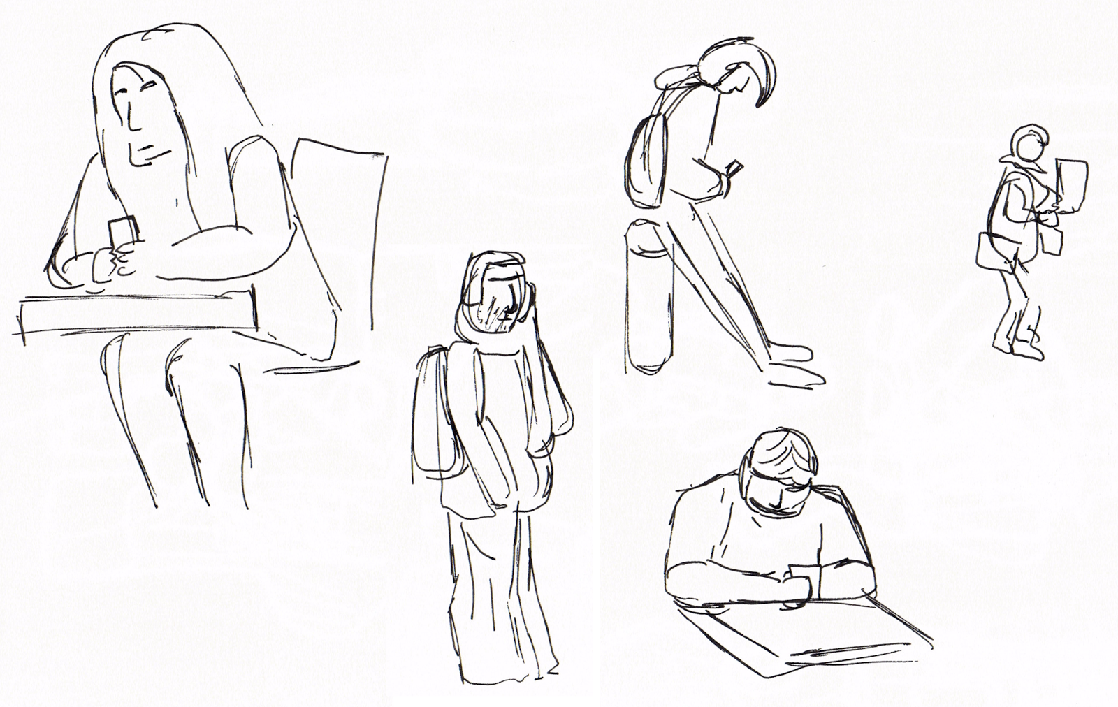
For the sake of variety and wanting to go somewhere different I headed to the first floor of the library and sat in front of the window to draw. People were closer up and generally paused for a little longer giving me a quick chance to sketch them out before they moved on.
I came up with a lot more interesting sketches here so I have a few favourites including the suited man with a simple rectangular face (and nose) as well as the ridiculously dressed student with hilarious hat. The old couple that spent some time at the town map where so characterised they were adorable to draw.


The skill evaluation aims were:
- Working quickly and fluidly
- Capturing sense of movement
- Capturing sense of personality or character
The first aim I think I achieved well. The entire exercise was something I got better with as the class went on with the more interesting and better sketches coming later on as I was more comfortable with the task. Although I could have filled out a few more sketches the problem with getting this done was mainly in relation to the second aim.
Capturing a sense of movement was a slightly challenge, mainly because of how fast people walk and how trying to take a snapshot and draw them in that pose is tough. I would've like to have tried drawing one person walking over a distance in multiple poses even if I didn't manage to get all their limbs in each time.
Capturing the sense of personality and character in a sketch came from how the person was drawn, as in which bits were focused on or even exaggerated. This was something I think got better over time with my more interesting drawings coming out at the end.
Thursday, 18 September 2014
Self Evaluation: Tonal Drawing
During this week's practical we were tasked with a tonal drawing study. Two objects were given to us which contrasting in their brightness and material. This was my drawing which took around 1h30m to complete:

Observation
I think the proportions of the objects were good and that they do look like the objects they are meant to represent.
Tonal Range
I used a selections of pencils I had including HB, 2B, 4B and 6B pencils. I did create a pencil shade scale and was satisfied on the whole although I'd like to have achieved darker tones but didn't have the correct pencil to allow me to do so. In the drawing I did manage to use the range of tones in the image, from the white box to the darkest point in the shoe.
Shading
The darkest point in the drawing was definitely beneath the laces of the shoes with the brightest part being the direct light hitting the box, I think the lighting on the objects was conveyed satisfactory although not perfect as tonal drawing is not my strongest skill.
I think the shading is let down in the background where I didn't spend as much time on. The paper quality also did not allow for the smoothest shading. If I were to do any future tonal drawings I'd like to invest in some better sketchbook paper.
Challenge
Some challenging parts of the drawing included the surface of the cube which was pretty smooth and very bright white. I did add in any scratches or dirt on the white block just to give it some more definition.
The shoe was also difficult as the material didn't allow for highlights and appears to be consistently black. This meant shadows where the only thing that allowed the object to show its shape.
Saturday, 13 September 2014
Self Evaluation: Perspective Drawing
During this week's Computer Arts Practice practical slot, I was tasked with a perspective study. With about 1h30m to complete it in, this is my drawing:

The skill evaluation aims were: drawing within timescale, observation, line work, and discipline to which I feel I completed all within a satisfactory level. In this post I will discuss both my strengths and weaknesses relating to these aims.
Drawing Within Timescale
With roughly 1h30m, I feel the timescale was generous enough to draw the entire view with the most important lines. A class in orthographic and technical drawing in high school made me comfortable with this exercise in timekeeping, making sure I put in the main lines in first, then worked down towards the details. I then gave myself ample time to correct and clean up lines.
Observation
I spent about 5 minutes just choosing a place I wanted to draw, something that would be interesting and that included enough elements to make a strong drawing. This corridor had a number of wall parts sticking out as well as doors, windows and pipes along the roof.
I picked a challenging spot sitting so close to the wall which gave for an interesting view of the corridor. Luckily there was a seat and table conveniently located in the corridor so that was fortunate.
Line Work
Lines are the main ingredient to a perspective drawing. I used a variation of pencils: a 2B, a 0.3mm and a 0.5mm technical drawing pencils. I also used a ruler to help with time efficiency and to make the lines cleaner and easier to work with. I tend to prefer a single straight line rather than drawing the line several times on top of each other to get a result.
Discipline
Overall I'm pretty happy with my finished drawing. If I were to move on from here I would like to try different perspectives or angles to draw from. Moving on from the single corridor setting I could try a location with pillars or more complicated geometry to add an extra challenge.
The drawing's not perfect though, I could have stepped back from the drawing more to make sure the lines and proportions were better. There is slight distortion in the corridor particularly in the roof at the top right.
Subscribe to:
Comments (Atom)